CASE STUDY
VMS TEAM
Medical Care Ambulant
Type of project: Branding, Product Design, Web Presence Direction
Services: Logo Design, Visual Identity, Product Design, Uniform Design
Tools used: Adobe Photoshop, Adobe Illustrator
Goal: Finding a visual identity of a Medical care company, creating logo matching with client’s vision. Giving a complete feel of professionalism
to a suiting profession with custom uniforms. Also giving a buisness right direction in web. Design of main product.
CASE STUDY
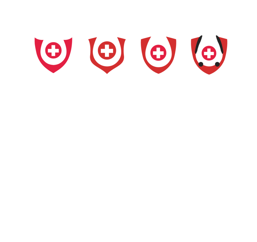
Client suggested that we keep the original concept of motives that the logo will be created of. In the first version of logo the logo vas made from house that represented home care, stethoscope and hearth.

IMPORTANT TO CLIENT:
KEEP SIMBOLISM
KEEP STETHOSCOPE
IV DROPS
logo & identity
The goal was to create a meaningful and symbolic logo that reflects the client’s vision. The final design subtly incorporates the shapes of a stethoscope, a droplet, and a shield — elements that together convey a sense of safety, professionalism, and trust. At the same time, the droplet highlights the brand’s core service: IV drops therapy.
final result
In the final mark, these three symbols — the shield, the droplet, and the stethoscope — come together to form a clean and balanced logo. The shield represents safety and protection, the droplet emphasizes the brand’s focus on IV drip therapy, while the stethoscope keeps a clear link to healthcare and the client’s personal preference. Combined, they create a distinctive visual identity that is both modern and trustworthy, perfectly aligning with the brand’s mission and values.

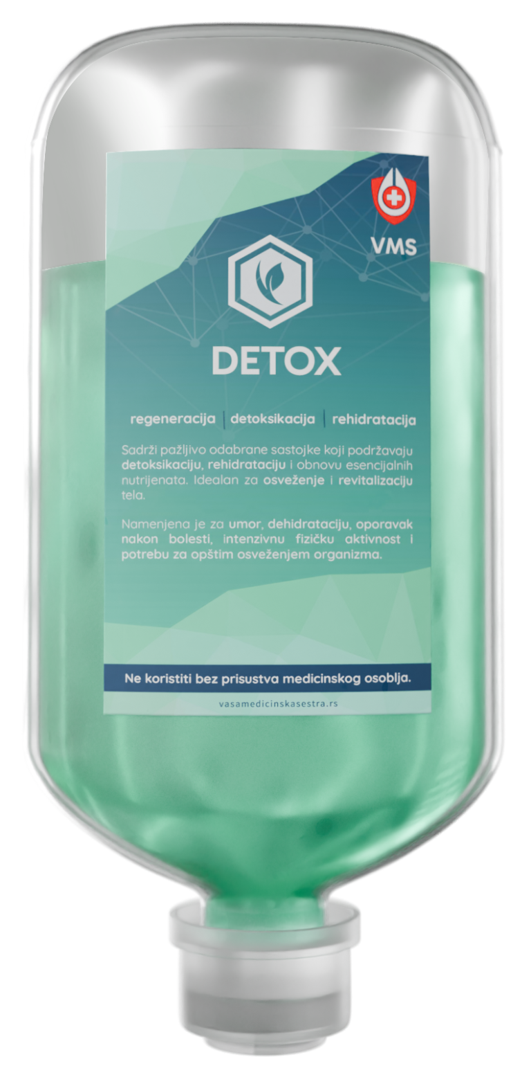
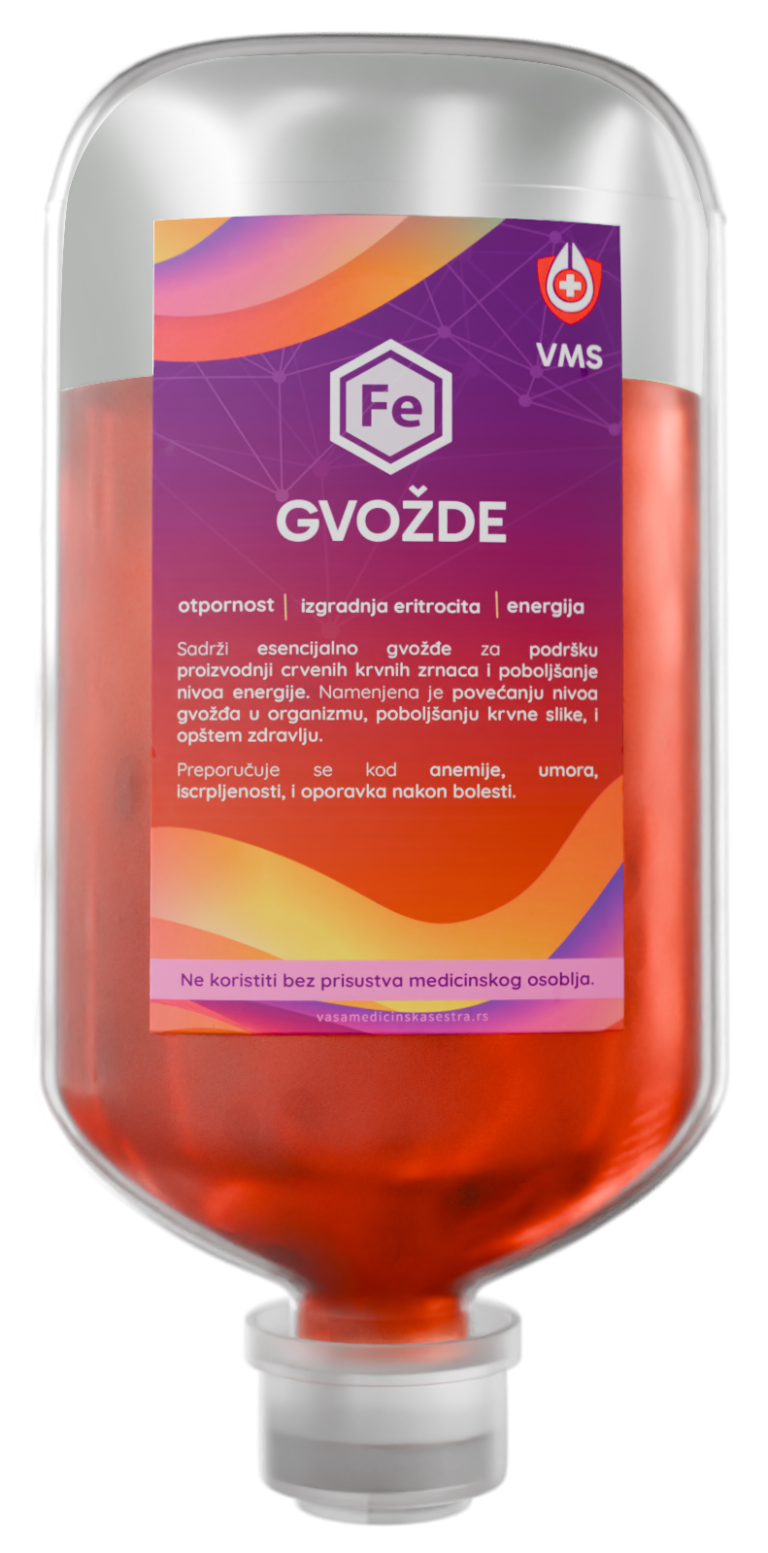
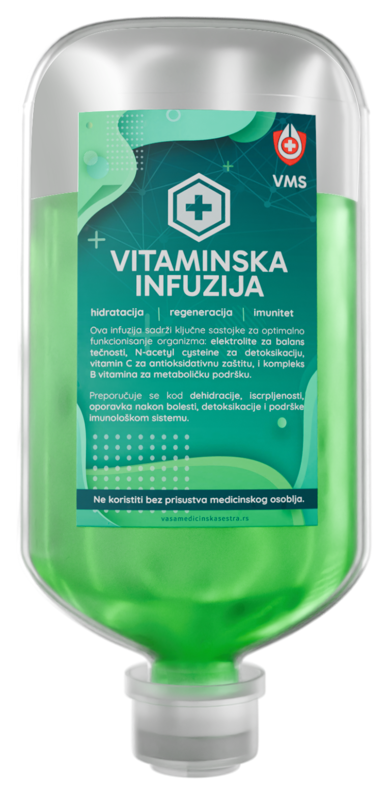
MAIN PRODUCT DESIGN
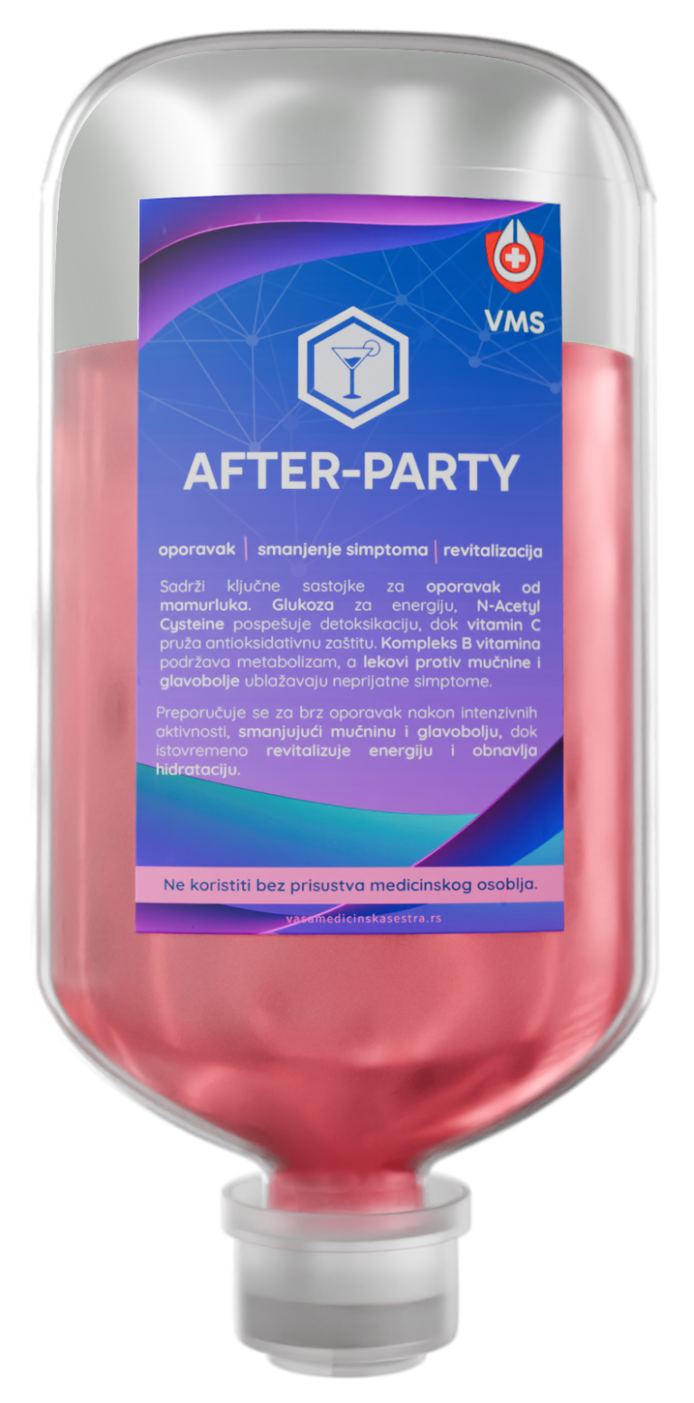
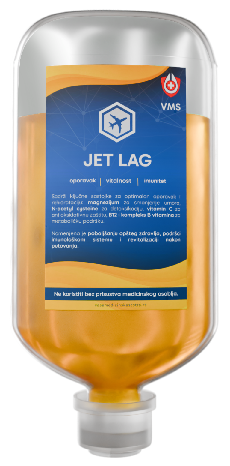
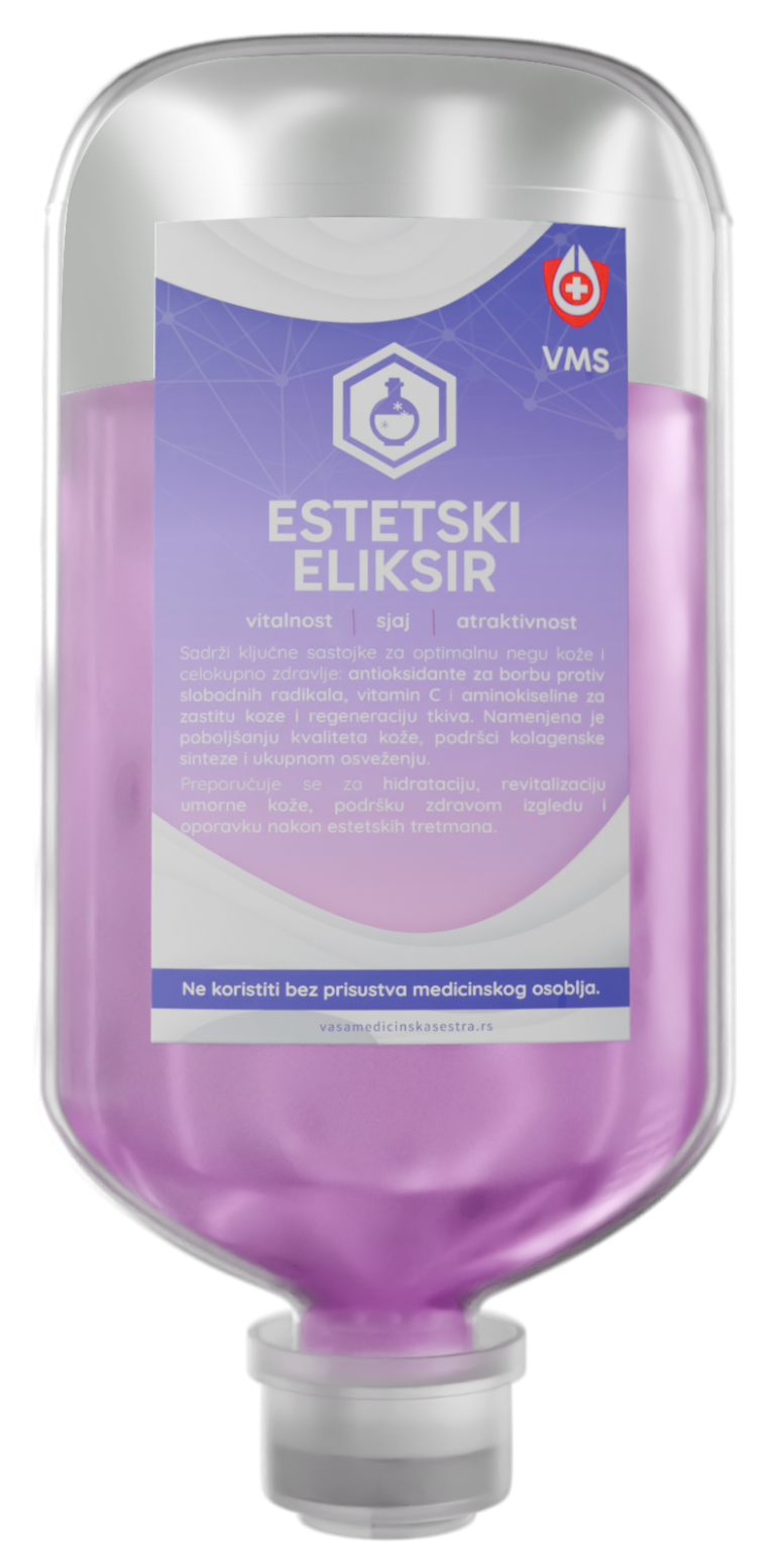
The client expressed a desire to push the boundaries of the typical visual language found in the pharmaceutical industry and requested something different. We developed a distinctive design solution for their flagship product — IV drops therapy from VMS.
hero suits
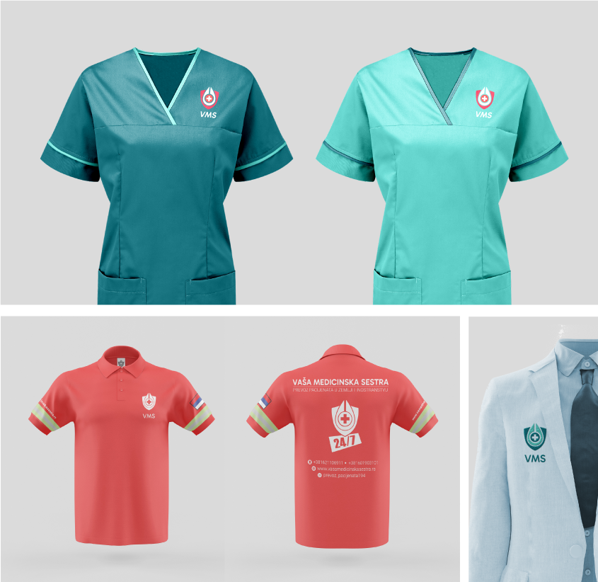
I designed the uniforms for this organization — from field technician outfits (for medical services) to ambulance driver uniforms, as well as a custom patch for doctor lab coats.
Printed promo material
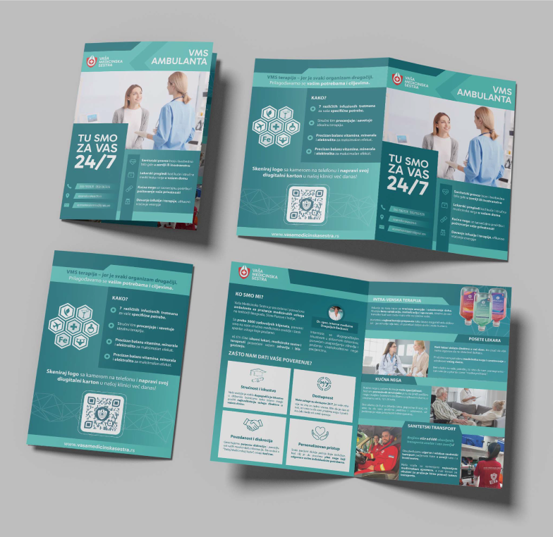
I created an A5 promotional brochure that briefly presents the client’s services and the core concept of the clinic. This was followed by additional print materials, all designed to align with the brand’s visual identity.
web presence
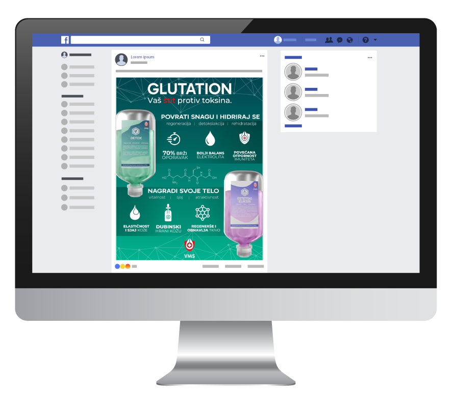
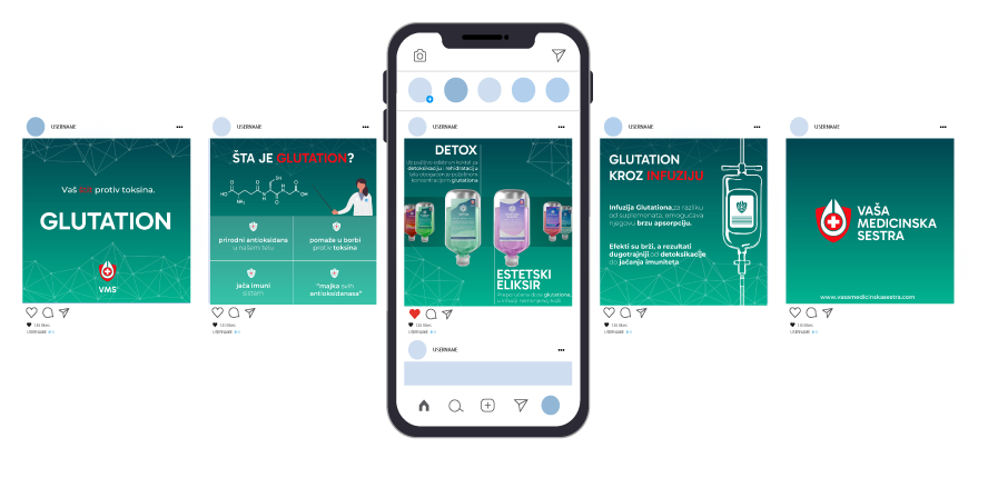
After finalizing the identity, the client asked to set the visual direction for their social media presence. Building on the core brand elements, we developed a consistent style for posts, combining clean layouts, soothing colors, and clear messaging.
Client suggested that we keep the original concept of motives that the logo will be created of. In the first version of logo the logo vas made from house that represented home care, stethoscope and hearth.
