CASE STUDY
MM TRANSPORT
International Freight Company
Type of project: Visual Identity
Services: Logo Design, Card Design
Tools used: Adobe Photoshop, Adobe Illustrator
Goal: To establish a solid and trustworthy visual identity for a modest yet reliable transport company. The goal was to create a new logo, business card, and vehicle stickers that would reflect the company’s values of professionalism, consistency, and growth. Through this updated identity, MM Transport aimed to improve brand recognition, build credibility with clients, and present a more cohesive and polished image across all physical and on-road touchpoints.
Creating a logo
I worked in parallel on developing both the client’s vision and my own concept, aiming to arrive at a solution that offers flexibility and clarity, while reflecting a sense of elegance and prestige the client was aiming for.
clients vision




alternative version


As the concept took shape, one particular variation stood out from the rest—capturing the spirit of the brand with clarity and distinction. This version became the foundation of the final identity.
final result
An appropriate typeface was chosen, and the version that best matched the desired tone and aesthetics was selected as the final logo.

Logo Implementation
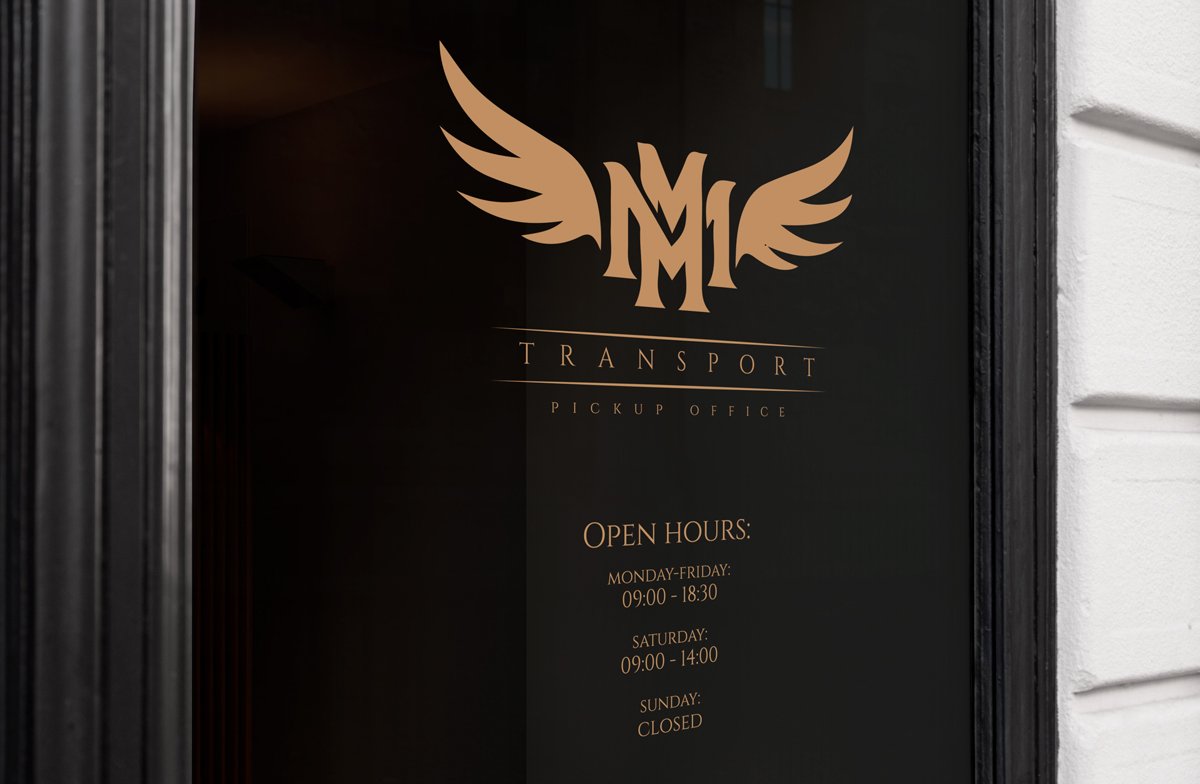
The logo integrated seamlessly and reinforced the brand’s tone across various applications — from local print materials to official documents and branded accessories.
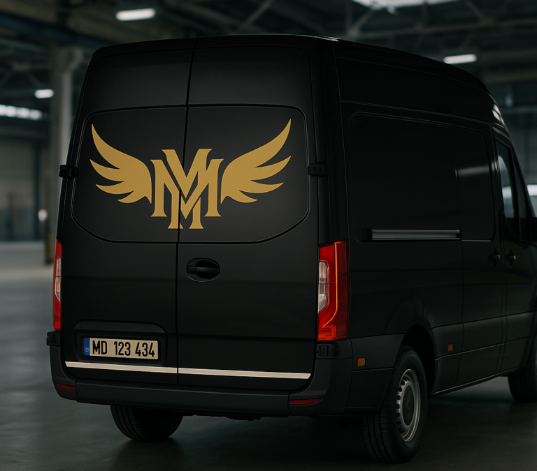
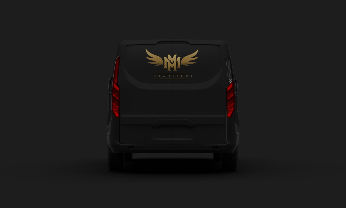
viechile print concept
We produced a mockup preview showcasing the sticker design applied to the company’s main vehicle — the van.
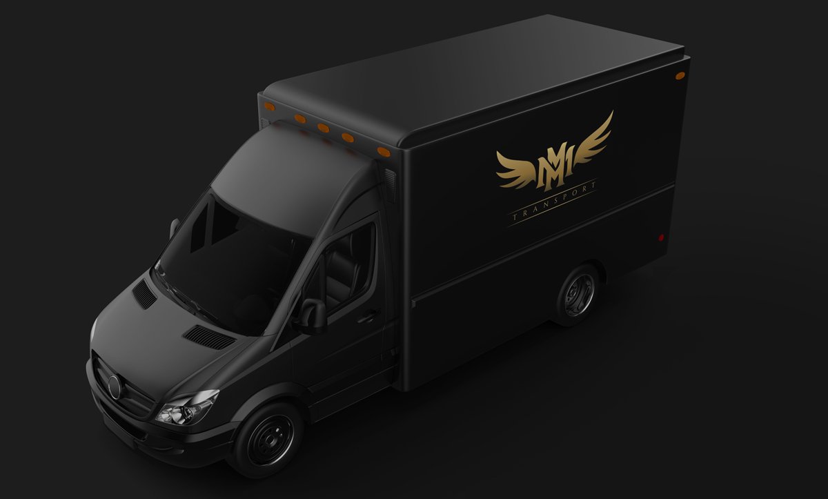
We also created a preview concept using mockups to showcase how the design would appear on the company’s official transport truck.


