KAFANA SOĆA
Traditional Serbian Grill House / Inđija
Type of project: Branding, Print Design
Services: Logo Design, Menu Design, Flyer Design
Tools used: Adobe Illustrator, Adobe Photoshop
Goal: Kafana Soća is an Inđija institution — a traditional Serbian grill house that built its name on the best roštilj in town. Started by old man Soća and carried on by his sons, it comes with a loyal following that swears by the food. The goal was to give that heritage a visual identity worthy of the reputation: a logo, a printed menu, and a promotional flyer that feel authentic, warm, and unmistakably Soća.
FROM MALA STANICA TO KAFANA SOĆA
The restaurant wasn't always Soća. For years it was known as Mala Stanica — "the little station" — a nod to the old railway stop to Belgrade that once stood on the site. The decision to rebrand back to Kafana Soća reclaimed the name it carried in its earliest days, and with it came a fresh start: a new logo and a full set of materials to match the name its regulars had known it by all along.
LOGO & IDENTITY
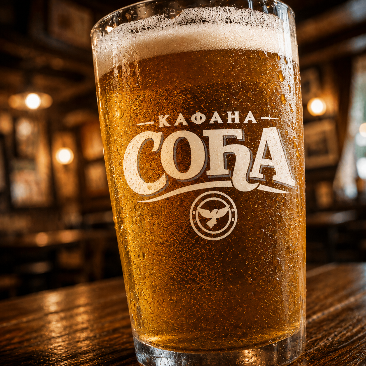
The identity started with the logo — the anchor of the entire brand. It was built in two versions: a full-color mark for primary use, and a clean white version for dark backgrounds and single-color applications, keeping the brand consistent across every surface.


THE MENU
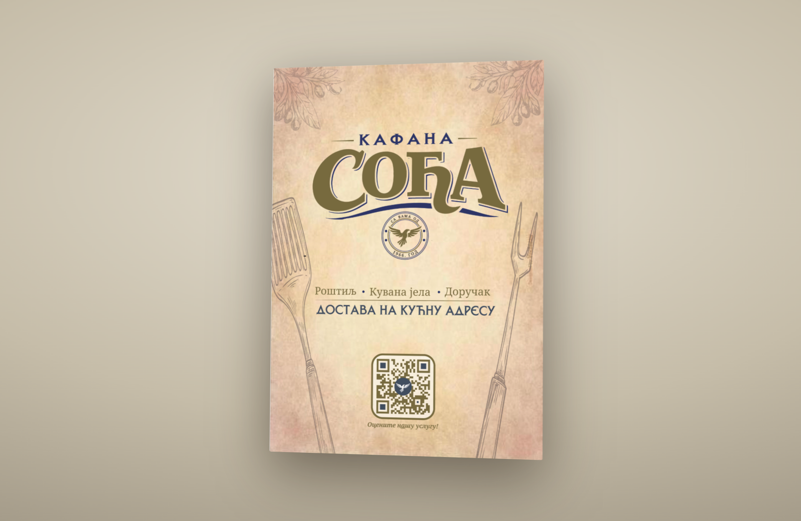
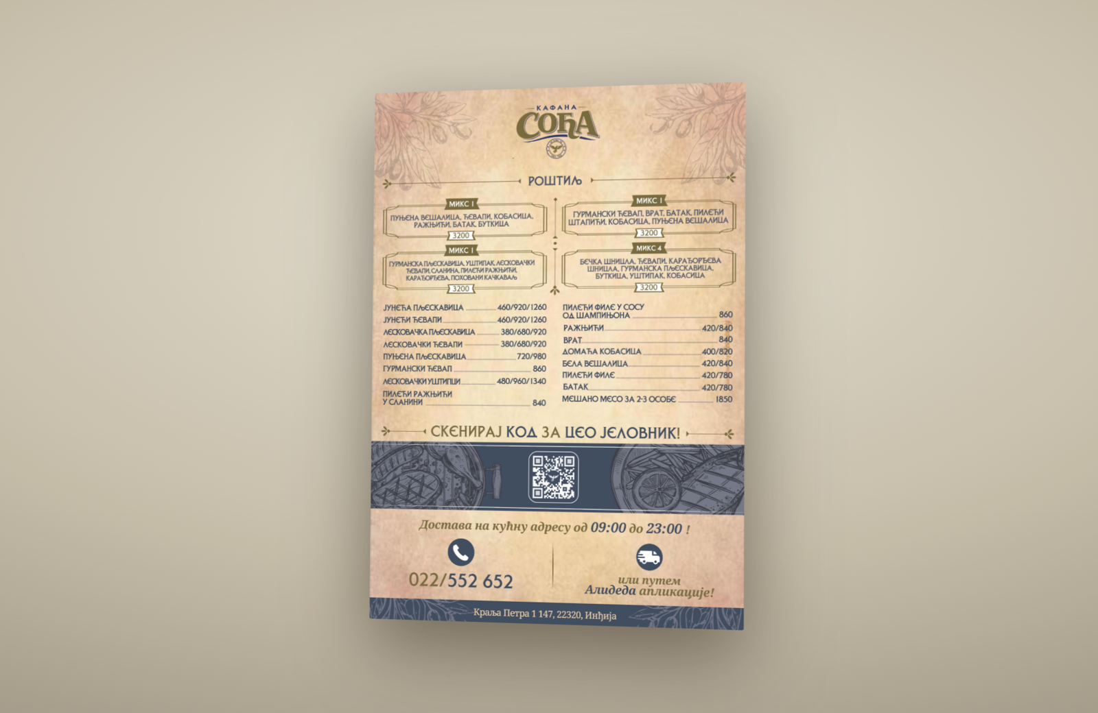
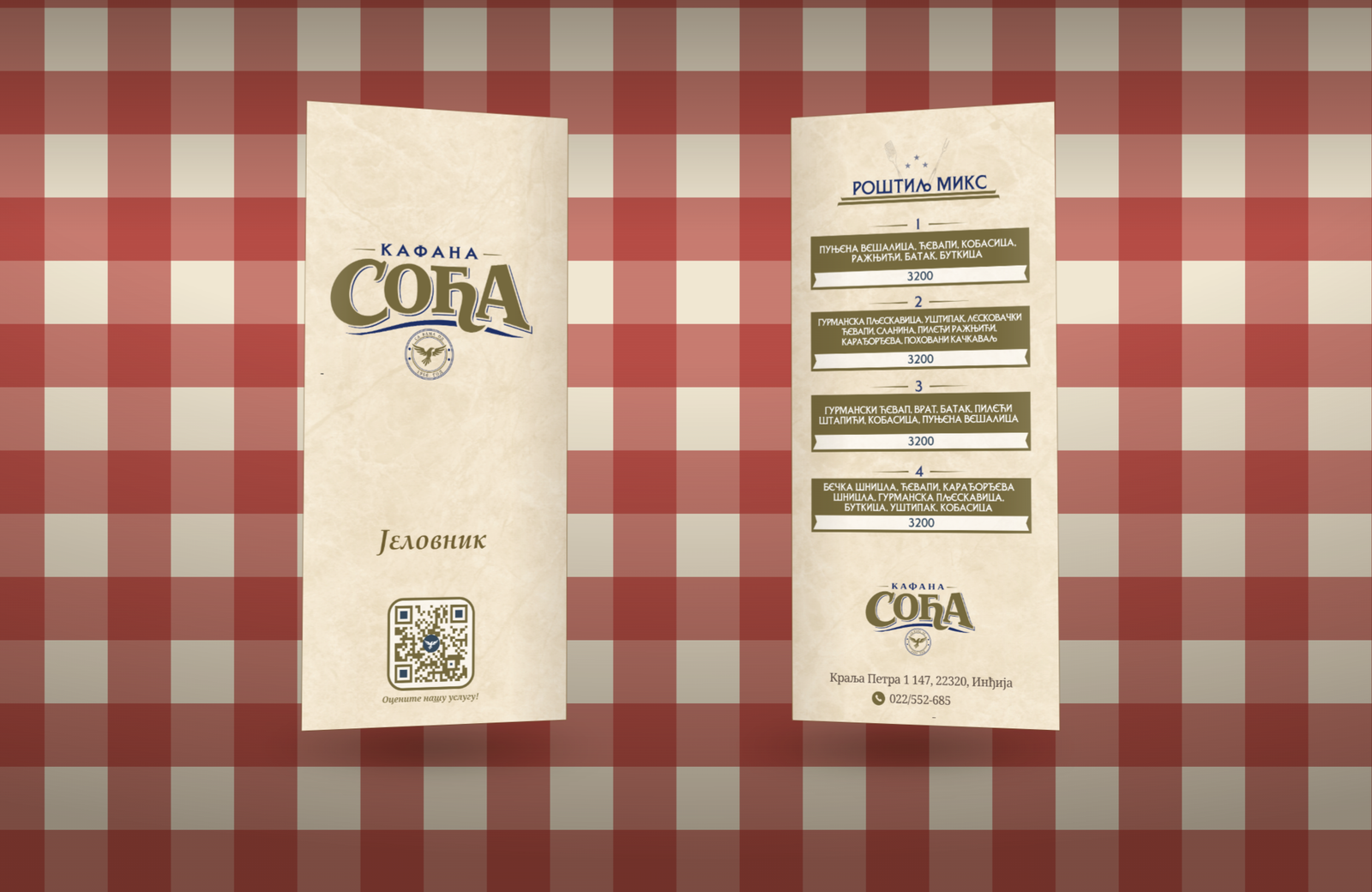
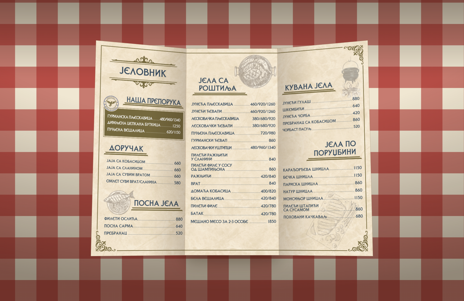
The menu carries the identity onto the table. Designed for clarity and easy reading, the layout keeps the food front and center while staying true to the brand's tone — from the cover down to the unfolded spread.
PROMOTIONAL FLYER
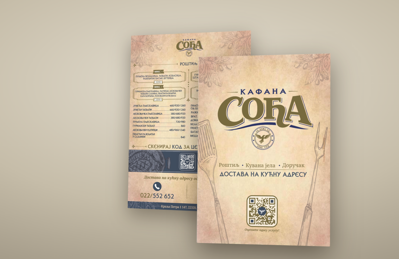
The flyer extends the brand into promotion — a double-sided piece designed to grab attention and communicate the offer at a glance. Front and back were treated as one continuous story.