CASE STUDY
ARTELJE
Medical Care Ambulant
Type of project: Branding, Product Design, Web Presence Direction
Services: Logo Design, Visual Identity, Product Design, Uniform Design
Tools used: Adobe Photoshop, Adobe Illustrator
Goal: Redesigned the logo and refreshed the visual identity of a theatre and acting school, defining the look of posters, print materials, and online presence to reflect its artistic and educational spirit.
Logo remastering
The logo was redesigned with the request to preserve the original motif. I refined it into a more minimal and balanced form, successfully maintaining its core concept.

old logo
The old version struggled with too many colors and confusing elements, which made it impractical and inconsistent across different applications. It lacked the clarity and durability that a strong logo needs to stand the test of time.

in process
Throughout the redesign, the goal was to keep the recognizable core shape but refine it into a simpler, bolder mark that leaves a stronger impression. The focus was on streamlining the details and improving balance, while staying true to the brand’s original idea.

refined new look
The final result is a clean, modern logo that retains the brand’s original form but with a clearer silhouette and a defined primary color. This ensures better recognition, easier reproduction across all formats, and a consistent visual presence that supports the brand’s identity moving forward.
result & implementation
The final result is a clean, modern logo that retains the brand’s original form but with a clearer silhouette and a defined primary color. This ensures better recognition, easier reproduction across all formats, and a consistent visual presence that supports the brand’s identity moving forward. Building on this foundation, the redesigned logo is now seamlessly applied across various touchpoints — from packaging and stationery to social media and digital channels — ensuring a unified and professional brand experience at every interaction.

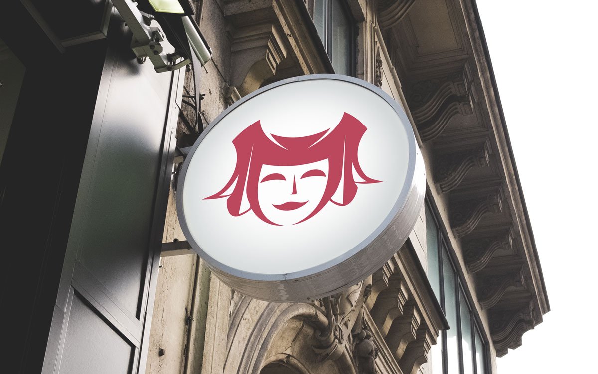
The logo integrated well into all upcoming branding materials, starting with the new sign placed above the entrance to the theater.
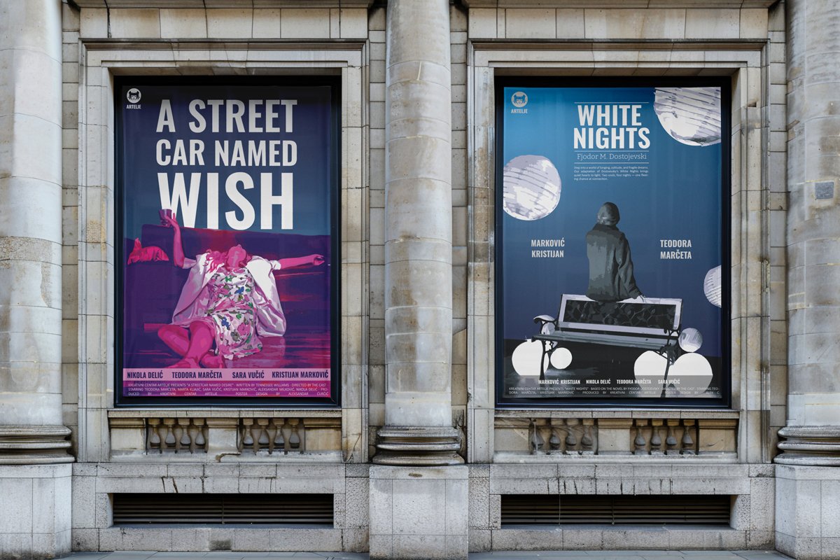
Along with the new visual identity, we established a distinct visual style for the posters. This style was applied to the design of two upcoming theater productions.
Social media
We established a style that followed the brand’s identity when creating posts for social media.
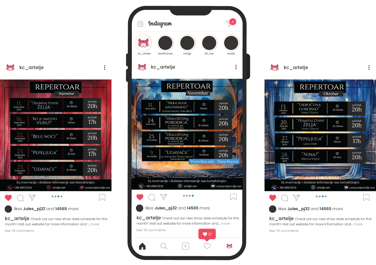
We created schedules for the performances that were shared on Instagram.
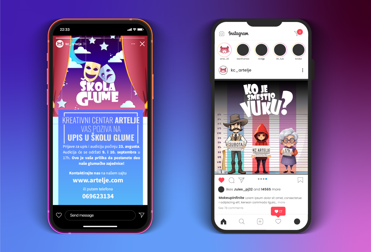
Additionally, we made posts aimed at attracting a young audience, since the theater had only an acting school and children’s plays.
